Coubic Booking Flow Case Study
I’m not affiliated with Coubic in any way and the views for this case study are strictly my own. It was done to challenge myself and to further hone my skills as an UI/UX designer. As a user of Coubic services myself I noticed things that could be improved and I implemented it in this case study.
About the Case Study
What is Coubic?
Coubic provides online scheduling and appointment booking solutions for service providers such as yoga studios, beauty salons and others. Businesses can set up a page where they receive appointments from their customers. On the other hand it allows customers to self-schedule their appointments with the business.
Why this Redesign?
During my time in Japan I was taking dance classes.The studio I was visiting offers classes in english and more than half of their clients are foreign visitors coming from all over the world. They offer class bookings on the Coubic website and this is the flow where I encountered several pain points that I wanted to address in this case study.
Problem
Making an appointment for a single dance class on Coubic is a frustrating experience. Studio’s profile page feels disorganized and the checkout flow is not optimized.
Goal
Make an intuitive website flow from viewing the dance studio’s profile on Coubic to making an appointment for one of their classes.
My Role
Sole UI/UX designer.
I collaborated with a senior software engineer to take into account technical limitations.
Project Duration
1 month.
UX Audit
There are a number of pain points I experienced when interacting with the Coubic website’s booking flow.
Website contains a lot of text and almost no hierarchy.
I wasn’t able to quickly scan and find the information I was looking for.
Navigation menu is confusing. I wasn’t sure if I should click “Booking” or “Calendar” to make an appointment.
No auto-recognition of existing studio membership.
If I’m a non-member and I incorrectly select the member’s price I’ll have to unexpectedly pay more at the studio.
If I’m a member and I incorrectly select the visitor’s price the studio will have to refund me the difference.
Calendar feels crammed and overwhelming.
It’s difficult to see the title of the class and it usually requires an additional click to check the class information.
No Luhn validation to inform the user of card number errors.
No auto-formating.
No visual emphasis on the security of the check-out.
Understanding the User
As a user myself I already had an idea about existing pain points. However, it is important to gather information from users with diverse backgrounds, perspectives, and abilities. All dance studio visitors are required to make an appointment through Coubic so I reached out to several in order to conduct user interviews.
The goal of the study was to understand user’s frustrations and problems they face when making an appointment through the Coubic website.
User Interview Findings
Users struggled to understand the meaning of tags you see under class information.
In order to view location on Google Maps an additional page has to be opened.
Competitive Analysis
Ability to search for classes on the same page for a week in advance.
When you have a lot of classes in a day list can get very long and overwhelming.
Clean design.
No ability to search for a specific class or instructor.
I was confused about the distinction between “classes” and “appointments”.
Ability to see past classes.
I can search by class and instructor but only for one day. I can’t search for a specific class in the future.
No indications of which day is today so it’s easy to get lost when looking for classes further ahead.
Ability to search for a particular class or instructor in the following month.
Feels very crammed and unorganized.
My Design Solution
Calendar
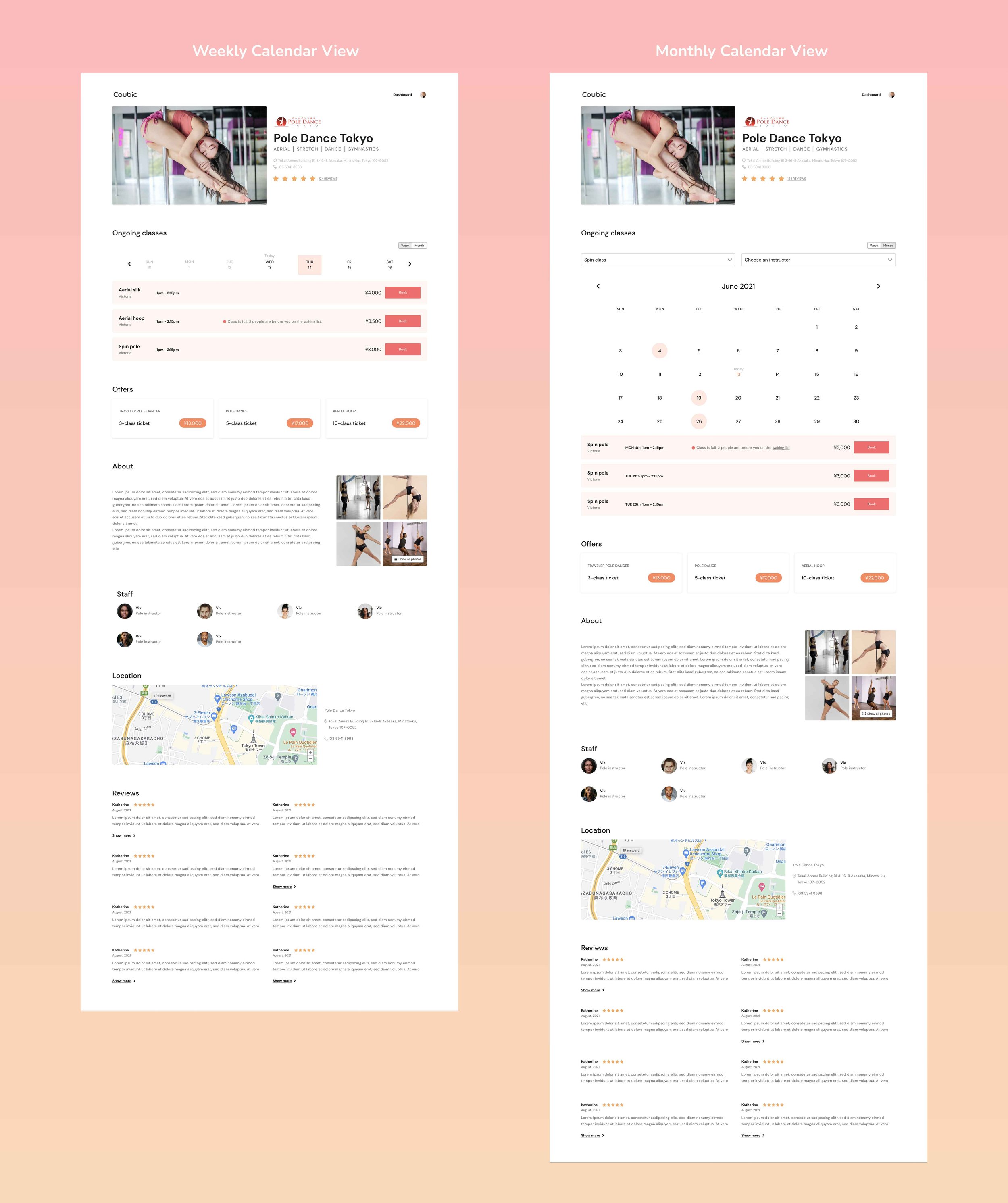
I designed the calendar with both weekly and monthly viewing option.
In weekly view the user is presented with a list of classes for selected day of the week.
In monthly view user can search for a specific class or instructor to see their scheduled classes for selected month.
Credit Card Form
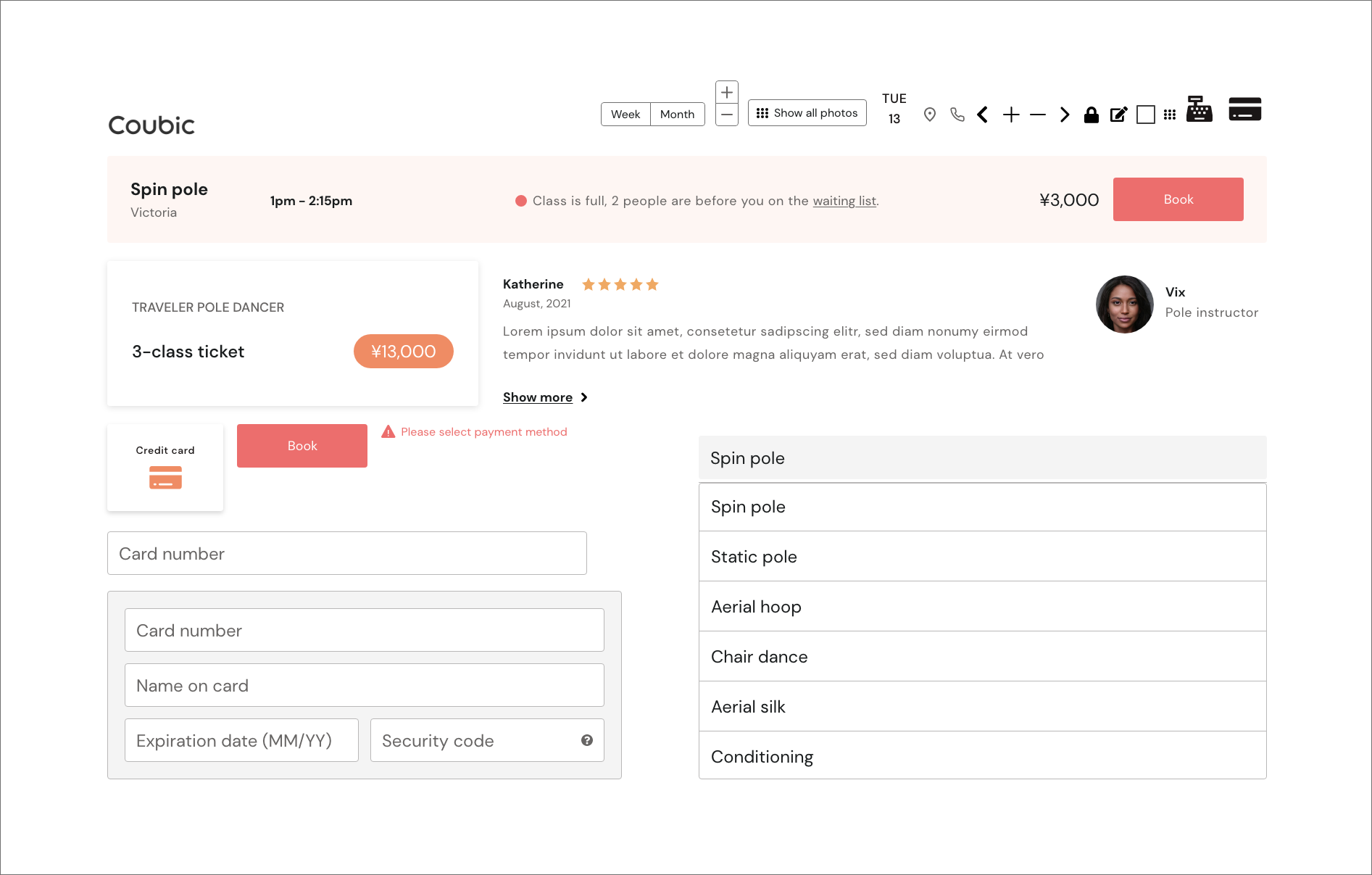
It’s important for a checkout process to be as optimized as possible. Credit card input form is a big part of it. I carefully thought about the placement and conducted a secondary research about credit card form implementations. Secondary research involves using already existing data. There is a lot of research on credit card form already done and it’s important to take advantage of that in order to save time and money.
Incorporating Luhn validation. Luhn's algorithm determines whether or not a credit card number is valid and it immediately informs the user if error is made.
Auto-formatting spaces in the credit card number field is essential to minimize user’s typing errors.
Visually emphasize the security of the credit card fields by adding a lock icon.
Incorporate card brand recognition to visually indicate the type of card being used.
There should be as few fields as possible in a single row layout (if inputs logically belong to one another 2 or 3 columns can be used as well)
Low Fidelity Design
Paper Wireframes
With all the pain points in mind I started with the wireframing phase. I started experimenting with paper wireframes before advancing onto digital ones.
Low Fidelity Prototype
Using paper wireframes as a base, I created digital wireframes and linked them together in a low fidelity prototype.
I used this low fidelity prototype for my unmoderated usability study.
Usability Study
I conducted an unmoderated usability study with 5 participants. This uncovered a few more improvement possibilities that I addressed later in my high fidelity mock ups.
I gave the participants 2 simple prompts that I wanted them to complete:
Find information about classes and book one class for tomorrow. Pay with a card.
Find all spin classes in the current month and book one. Choose pay on-site and return to the studio’s profile page.
Findings
Some users tried clicking on the class title mistakenly thinking it was a button.
Users were’t sure what is the difference between “full” and “waiting list” label next to the classes.
High Fidelity Design
With all the findings from my two usability studies and secondary research I started working on the high fidelity design.
Design System
I used brand Coubic’s colors and created my own components that I used throughout the whole design in order to keep the design consistent and clean.
Mockups
I incorporated findings from my usability study and created high fidelity mockups that I later connected in an interactive prototype.
High Fidelity Prototype
As a final stage of this case study, I connected the mockups into an interactive high fidelity prototype.
Impact
When I shared the prototype with my co-studio visitors they were positively surprised about the newly created flow. All of them said they would rather use my design than the current one.
“This is much more pleasant than the current solution. I really like the option of weekly and monthly view. It gives me great overview of the classes I usually like to take.”
What I Learned
I learned that bad design is quite obvious and frustrating while good design will oftentimes go unnoticed. A good design can make a difference in one’s quality of life and this is the main reason why this line of work brings me so much joy and satisfaction.
In order to expand my design skills I decided to work in Adobe XD for the first time for this project. I realized that most popular UX tools have a lot in common and it’s relatively easy to switch between them. This gave me confidence that I can conquer any future design tool that might come our way in the future. Adaptability is key in this ever changing world.


