Project
Abstraq is an audio tour app for an abstract art gallery.
Project Duration
1 month.
Problem
Traditional audio tour guides are inconvenient and not engaging. The audio device needs to be held near ears in order to hear the audio. Users can’t use their own headphones and audio is lacking in features such as skipping forward or adjusting audio speed.
Goal
Overcome existing problems by creating an alternative approach to traditional audio tour guides. Creating a more pleasant experience will greatly increase customer satisfaction. High customer satisfaction leads to user’s willingness to revisit and recommend the business to others.
My role
Sole UI/UX designer.
I collaborated with a senior software engineer to take into account technical limitations.
User research
As a part of the foundational research I conducted 5 user interviews. I identified the primary user group as adults interested in arts and culture. They either work in an art industry or art is simply their hobby. They also regularly visit museums and art galleries.
User pain points
Unable to use personal headphones
In museums visitors are usually given audio tour guides. They must be held near your ears in order to hear.
Unable to seek audio tracks and change audio speed
Audio tours don’t have a feature that lets users seek backward or forward or change the audio speed.
Hard to locate yourself in the gallery space
Users are struggling to locate themselves in big spaces with complicated floor plans.
Inserting the correct audio track number
Visitors often make mistakes when inserting a specific audio track number for the artwork they’d like to listen to.
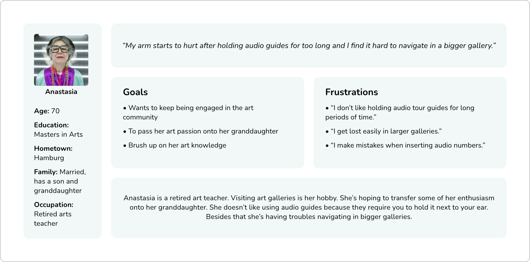
Creating Personas
It’s important to ensure the app benefits a wide range of users so I built 2 personas for the purpose of this project.
I created these personas by pinpointing the most common themes from my user research data. This helped me to truly connect with the target users.
User Journey Map
I created Anastasia’s user journey map to focus on what she might think and feel at every step of her art gallery experience. Creating a journey map forces you to look at how your customers actually experience your brand versus how we think they do.
This opens up new opportunities for enhancing and elevating the overall customer experience.
Tasks
She locates the gallery and checks online options for tickets.
Feelings
Anastasia is curious and interested about the gallery she hasn’t visited before.
Add an option of buying admission tickets within the app.
Tasks
She’s waiting in ticket queue and downloads the app.
Feelings
She feels impatient and disheartened because of the crowds and long lines.
Add gallery’s rush hour notifications.
Tasks
She’s using the app and navigating herself in the gallery.
Feelings
Anastasia feels lost in the gallery. She is frustrated because she can’t hear the tour well.
Incorporating accessibility for users who can’t hear well.
Tasks
She’s searching for a place to sit and rest.
Feelings
She feels contented but tired at the end of the tour. She wonders what to do next.
Add “What to do next” suggestions.
Problem statements provide a clear description of the user’s need that should be addressed. The better a problem is expressed, the easier and more effectively it can be solved.
Problem Statements
Anastasia is a retired arts teacher who needs a more accessible tour guide app because she gets tired easily.
Ian is an art enthusiast who needs a more engaging gallery audio tour because he gets bored easily.
Wireframing
Paper Wireframes
I wanted to create a flow that would be well-suited for addressing the above mentioned user pain points.
For faster iteration, I started with paper wireframe creation before moving onto digital wireframes. Wireframes were based on findings from the user research.
Digital Wireframes
Following the creation of paper wireframes, I converted them into digital wireframes using Figma.
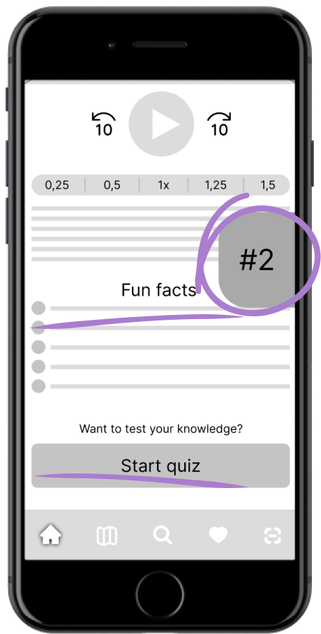
Control the speed of the audio.
Ability to seek backwards or forwards.
With the help of Bluetooth beacons, pop-ups appear when the user is standing near an artwork so they don’t have to insert audio numbers themselves.
Fun facts and Quiz sections to keep the user engaged.
Low Fidelity Prototype
Low fidelity prototype gives an idea of how the app will work in real life by visualizing the primary user flows.
This prototype was used in the usability study I conducted in order to determine the intuitiveness of the design.
Usability Study
I conducted two rounds of unmoderated usability studies to determine how easy it is for participants to complete the app’s primary user flows.
First round was conducted using a low fidelity prototype. The outcome from this round helped influence the design from wireframes to mockups. The second round of studies was conducted using a high fidelity prototype. The outcome from this round revealed what aspects of the mockups needed further refining.
Talk me through your thinking process. As soon as you complete one prompt go to the next. Please do them in the following order:
Prompt 1: Start a tour and view 2 artworks.
Prompt 2: View previous artwork.
Prompt 3: Skip artwork #3.
Prompt 4: Find alternative way to view artwork number #3.
Prompt 5: Mark artwork #3 as a favorite.
Prompt 6: Find your favorited artworks.
Round 1 Findings
Ignoring an artwork prompt is not intuitive so users are pressured into opening details for artworks they are not interested in.
Users are confused with map and search options being separate.
Round 2 Findings
Home tab isn’t reflecting what the users expect to see there.
Recommended search content is too overwhelming.
User should be able to zoom in on the map.
Design System
I built a design system by defining primary colors of the app and creating shared components, including the app logo. This is important in order to ensure consistency throughout the whole design.
Refining Mockups
These changes are based on the findings from the second round of usability studies.
Recommended content displayed on the Search tab was very overwhelming to users. I changed the content layout and added more white space to let the design breathe.
Home tab was just a blank page before users would start the tour. I decided to move the map to the Home tab because it is useful to the users when they are walking around the gallery.
It wasn’t immediately apparent to the users that the map can be zoomed in. I decided to solve this issue by integrating Google Maps. This has the added benefit of giving the users a more familiar experience.
High Fidelity Prototype
I connected the refined mockups and created a high fidelity interactive prototype that will closely match the final product.
To simulate the flow of an actual physical tour in the Abstraq gallery, please follow the hotspot hints in the prototype.
Accessibility Considerations
Visitors can either read the text or listen to the audio.
In order to make the text legible I carefully considered the text height, line height, contrast and typeface. Dynamic text type is used to change text size according to the user's text settings.
I used icons to help make navigation easier.
App is localized in multiple languages.
Impact
Abstraq adds value to the gallery visitors and enhances their experience instead of just providing plain information. Based on feedback I got from my usability study participants this version looks and functions better than the current solution.
“I love the simplicity of this design. I would definitely prefer using this over the usual audio tour guides.”
Success of the Design
To further determine the success of my design there are 2 measures I would take:
Qualitative research: The goals of this project is to enhance customer satisfaction. Using surveys to gather information from users can provide valuable insights into the minds of the users.
Quantitative research: Another way of how I would measure success is by monitoring the number of visitors and their interaction with the product. When customer satisfaction is enhanced it leads to a positive word-of-mouth, better reviews and stronger reputation. This leads to a wider audience and potential new customers. I would also measure the Net promoter score which measures customer experience and predicts business growth.
What I Learned
The whole project was one big learning experience for me. While I was getting to know the UX process close up and conducting all research by myself my respect for the industry grew deeper and deeper. I love the fact that human psychology is in the center of the process and while it seems like we’re designing a product, we’re really designing how the product will interact with people.
I love the fine line between creativity and data backed by research. While creativeness is important, it’s essential to prove the effectiveness of it with research.
Furthermore, the design process never really ends as there is always something to improve. The feeling of content when you finish a design doesn’t last long and while it may sometimes feel frustrating it also leads to constant improvements and greater achievements.


